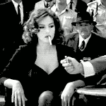
Catman25 Posted January 30, 2009 Report Share Posted January 30, 2009 [spoiler=.]Credit to http://redheadstock.deviantart.com/journal/12379986/ for brushes Link to comment Share on other sites More sharing options...
El Beasto Perezoso Posted January 31, 2009 Report Share Posted January 31, 2009 Kinda small, but nice Link to comment Share on other sites More sharing options...
Catman25 Posted January 31, 2009 Author Report Share Posted January 31, 2009 Thanks, it's about sig size, or is it? Link to comment Share on other sites More sharing options...
problematica Posted January 31, 2009 Report Share Posted January 31, 2009 Size is fine Background is empty as hellMost of the colors don't go togetherBad blendingDon't just put some brushes as the background, try putting an actual background like a stock image or make one, but don't just put some gradients of colors Link to comment Share on other sites More sharing options...
Zaca Posted January 31, 2009 Report Share Posted January 31, 2009 Render is blurry.Blending is bad.Alot similar to your other sig. Link to comment Share on other sites More sharing options...
Soul Legacy Posted January 31, 2009 Report Share Posted January 31, 2009 Agree'd with above, but it is nice Link to comment Share on other sites More sharing options...
Mr.Big Posted January 31, 2009 Report Share Posted January 31, 2009 Dude the colors xD Render is blurry and doesn't blend and I don't really like the white brushing. Add some more effects and c4d's, follow some tuts man @_@ Link to comment Share on other sites More sharing options...

Recommended Posts
Archived
This topic is now archived and is closed to further replies.