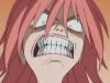
Shrekstasy Posted December 5, 2008 Report Share Posted December 5, 2008 DustglanceThe Mummified PokemonGround/Ghost This is the first draft, I'll reshade, recolor, and anything else suggested later. I want to know if it's coming along okay.-MADE IN PAINT- Edit: I fixed a few problems, any other suggestions? Edit2: I redrew it, following the shading directions. I've yet to complete the bandaging, though. Done:DustglanceThe Mummification PokemonGhost/Ground Link to comment Share on other sites More sharing options...
.arx Posted December 5, 2008 Report Share Posted December 5, 2008 Did you make this with Photoshop or GIMP? Cause if you did it with those: 7/10With Paint: 10/10 Link to comment Share on other sites More sharing options...
Shrekstasy Posted December 5, 2008 Author Report Share Posted December 5, 2008 Did you make this with Photoshop or GIMP? Cause if you did it with those: 7/10With Paint: 10/10 Paint. Link to comment Share on other sites More sharing options...
.Requiem Posted December 5, 2008 Report Share Posted December 5, 2008 It is good for paint. 8/10 Link to comment Share on other sites More sharing options...
D-Striker Posted December 5, 2008 Report Share Posted December 5, 2008 Cool!!!!!!!! How you do with paint?????????? Link to comment Share on other sites More sharing options...
Shrekstasy Posted December 5, 2008 Author Report Share Posted December 5, 2008 Cool!!!!!!!! How you do with paint?????????? Well, today I was drawning abstract pictures: a triangular fish-head serpent spitting out a skull and spinal cord and this. I used the circle shape and made it a decent size. I drew an eye shape inside it, then drew the pupil. Then I added the bandages. Then I shaded and colored for about 15 minutes... It takes a bit to do, providing a clear picture. I'm sure Jappio could explain it better... Link to comment Share on other sites More sharing options...
Sixty Posted December 5, 2008 Report Share Posted December 5, 2008 It's staring at me... >,<' I think it should be smaller. I think it exceedes the offical Pokemon sprite height. Link to comment Share on other sites More sharing options...
.arx Posted December 5, 2008 Report Share Posted December 5, 2008 Paint??? NO WAI!!! 10/10 Link to comment Share on other sites More sharing options...
Sixty Posted December 5, 2008 Report Share Posted December 5, 2008 Paint??? NO WAI!!! 10/10 It is not hard to make outstanding art in Paint, y'know. Link to comment Share on other sites More sharing options...
.arx Posted December 5, 2008 Report Share Posted December 5, 2008 It isn't? Whoa. I did not know that. Link to comment Share on other sites More sharing options...
Sixty Posted December 5, 2008 Report Share Posted December 5, 2008 It isn't? Whoa. I did not know that. Look at my Paint art threads, for example. Link to comment Share on other sites More sharing options...
Jappio Posted December 5, 2008 Report Share Posted December 5, 2008 Well the first problem I had and noticed is the way it looks in general. I'm going to guess it isn't suppose to look flat, like its made of wooden planks. You probably wanted it to look like a sphere. Well there are a number of reasons as to how you sort of messed that up. One reason is how you have the bandages done. You have them drawn perfectly straight. One a sprited sphere though, the should be round, wrapping around the thing inside. The second reason is the shading. Normally with the shading on a sphere is that it also wraps around the sphere. You though have it jagged and straight. I'm not saying they should be perfect curves exactly, the bandages would make it not a perfect sphere. Yet the way you have it it would be that way on some weird bumpy coin wrapped in bandages. Shading in general as some issues too. The way you dithered doesn't look exactly right. If you're wondering what dither means, its when you make a checkerd board pattern with the two shades. I'm not saying you should have it, and it probably will be fixed if you curve the shading. I'm just pointing out though the dithering doesn't exactly work. Also that bottom hanging strap could use some shading. The dark gray on top of the eye seems a tad too dark. The shape is ok, but has its flaws of course. I don't like the dangling strap, seems really off. Also all the rest of the bandage seems much wider than the one hanging off. The circle is a little straight and bumpy in a few parts. When doing circles, the length of the lines making it up should go in number order. If you don't get what I'm saying, I have a diagram for that: Now as for Fakemon nitpicky details. The light source isn't in the right place. Generally for Pokemon, and most sprites, the light shines form the top left, you have it coming form directly above. The sprite itself is also too tall, by about 13 pixels. In general they also face the left, or at least their faces do. This though are just the basic rules of Pokemon sprite. Your sprite isn't quite worse as a sprite because of these things, but it's not in the true Pokemon style. Also to once again clear up. Drawing sprites in paint is not in any way that much harder than gimp or photoshop. Most spriters I know use paint, it's what I also use. Paint can handle pixels just as well as any other program, and the others just have more useless tools. Being shocked a sprite is done in paint is like being shocked that I typed this critique with a keyboard. Sorry to get a tad off topic there. The fakemon isn't bad, but has its flaws. Good to hear though you're open to the suggestions and willing to go back and fix them. I dread the day I have to go back and fix all mine. I'm waiting till all my Fakemon are made to do that though. Link to comment Share on other sites More sharing options...
Zaca Posted December 5, 2008 Report Share Posted December 5, 2008 Not the best i've every seen but it's really nice espicially for a first. Link to comment Share on other sites More sharing options...
Nɇvɇrmorɇ Posted December 5, 2008 Report Share Posted December 5, 2008 sweetness, made from paint?!?! 10/10 Link to comment Share on other sites More sharing options...
Luna Lovegood Posted December 5, 2008 Report Share Posted December 5, 2008 Greatness. I love it 10/10 Link to comment Share on other sites More sharing options...
Jappio Posted December 5, 2008 Report Share Posted December 5, 2008 Shading could still be rounded, and same goes for the bandages. That one dark bandage on it, right below the eyes, that looks really out of place and weird. Here, I went ahead and whipped up a quick example on shading for spheres: Now don't just go copying the shading exactly, this is for perfect spheres, yours is more wide than a sphere, and has more bumps and stuff. The bandage hanging down I still don't like, smoothing it up more would be nice. The sprite has improved though, keep up the good work. Link to comment Share on other sites More sharing options...
Kizzi Posted December 5, 2008 Report Share Posted December 5, 2008 I agree with Jappio, despite not reading his post in this instance. The main problems I see personally are the lack of 3D-ness and the weird positioning of the bandage. Did you make this with Photoshop or GIMP? Cause if you did it with those: 7/10With Paint: 10/10 Get the hell out of the showcase section, or at least stop spamming pixel art threads. Link to comment Share on other sites More sharing options...
Shrekstasy Posted December 6, 2008 Author Report Share Posted December 6, 2008 ~Bump~I believe it's acceptable now. Link to comment Share on other sites More sharing options...
DarkArmedDragon118 Posted December 6, 2008 Report Share Posted December 6, 2008 Nice for paint. 10/10 Link to comment Share on other sites More sharing options...
Jappio Posted December 6, 2008 Report Share Posted December 6, 2008 You've shown so very good imrpovement, but some problems persist and you have some new ones. I don't quite get why it is now fuzzy, or hairy. The red bits are bordered by blue lines, either those borders should be dark red or the bandage borders. The shading has imrpoved greatly, but when you made it face the proper direction, you also messed up the light source. I'm not saying its a bad thing, or you need to fix it. Just that in Pokemon sprites, its always from the top left, but thats just some silly Pokemon sprite rule. You still haven't rounded the bandages though, so it still looks a little 2D, but the shading is helping. The unraveled bandage I still don't think looks right and the way you have it now it doesn't look thin like a bandage. A side suggestion: If you like this hairy look, realistically there should be hairs on the front side, not just around the side. Link to comment Share on other sites More sharing options...
piplup_fan Posted December 9, 2008 Report Share Posted December 9, 2008 wow amazing i cant wait to e the game you put him in!!!(i know you probably wont but you could easily pm me) Link to comment Share on other sites More sharing options...

Recommended Posts
Archived
This topic is now archived and is closed to further replies.