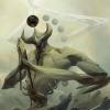
Enrise Posted November 4, 2008 Report Share Posted November 4, 2008 As the title says it all, you want to see it, right? Well, here it is: Dark Winged Arceus: I used Arceus (Of course), Dialga's little crest at the chest, and I used Ho-Oh's wings. Please do not rate, for I hate it when people rate, because it may not suit their tastes period. So, no rates. You cannot spam nor flame also, for I will either Neg Rep, or Report. Enjoy. Link to comment Share on other sites More sharing options...
Zack Blaze Posted November 4, 2008 Report Share Posted November 4, 2008 It looks cool, but I dont like the blue on the wings 7/10 Link to comment Share on other sites More sharing options...
Enrise Posted November 4, 2008 Author Report Share Posted November 4, 2008 Did I not say to not rate it? Well, despite that, I guess I thank you for your rate. But don't do it again when I say not to. Link to comment Share on other sites More sharing options...
Jappio Posted November 4, 2008 Report Share Posted November 4, 2008 Ok, we can't rate, but what about critique and opinion? I mean if we can't do either of those, then what do people respond with? If I can critique though, I will. Link to comment Share on other sites More sharing options...
Enrise Posted November 4, 2008 Author Report Share Posted November 4, 2008 I never said anything about not critiqueing, so go for it. Just don't rate is all. Link to comment Share on other sites More sharing options...
Jappio Posted November 5, 2008 Report Share Posted November 5, 2008 Just wanted to make sure, some people might mean critique when they say rate. Well I have to say, you made it way too complex with not enough attention to detail. It overall looks very complex, it's hard to see what is going on. When looking closer though it still retains this problem. It also doesn't help that all your colors seem all over the place and very sloppy in general. With your coloring, you need to be more careful with color choice and where they go. All over Arceus's body you have gray outlines. That would be ok "IF" you had the inside color lighter. The problem is though your borders are lighter than the insides. Borders typically should be darker than the inside. Speaking of borders, you have a problem with the wings. Everywhere I see blue borders, and that just looks bad on top of the purple. The feathers are also not shaded at all, just two tones of purple. The random white spots don't make sense either. Now the whole thing about it's hard to tell what is going on. You used the same wing a whole bunch, which is never good. The thing is though the wing is big, weirdly shaped, colored odd, and there are a whole bunch all over the place. I mean the ones on it back I can't even tell if they'd be good for anything. Overall the coloring is off, borders are bad, it's way too cluttered, and it's maybe a tad too complex. Work on taking your time and getting to all the small details. Too many small details can make a big problem. Link to comment Share on other sites More sharing options...
-DG- Posted November 5, 2008 Report Share Posted November 5, 2008 You always give the greatest details, you and problematica ^_^. Anyways, I agree with Jappio Link to comment Share on other sites More sharing options...
Enrise Posted November 5, 2008 Author Report Share Posted November 5, 2008 Jappio, the white spots are from Ho-Oh's wings. So they aren't random white spots. Link to comment Share on other sites More sharing options...
The Ruby Posted November 5, 2008 Report Share Posted November 5, 2008 Jappio' date=' the white spots are from Ho-Oh's wings. So they aren't random white spots.[/quote'] And that is why your supposed to change it...The splice is way too dark, and complicated like jappio says. This is YOUR first official Splice?Pretty good for a beginner Link to comment Share on other sites More sharing options...

Recommended Posts
Archived
This topic is now archived and is closed to further replies.