Catman25 Posted July 12, 2015 Report Share Posted July 12, 2015 in a vacuum this looked decent; up against y'all, no chance. Congrats Rai, sick work m9 Link to comment Share on other sites More sharing options...
Smear Posted July 13, 2015 Report Share Posted July 13, 2015 Liked this piece. Colours are hot af. Link to comment Share on other sites More sharing options...
Catman25 Posted July 13, 2015 Author Report Share Posted July 13, 2015 thanks yo, throw basics out the window Link to comment Share on other sites More sharing options...
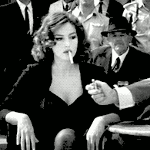
Twenty-five Zero Oh-oh Posted July 13, 2015 Report Share Posted July 13, 2015 I quite liked your colors. However, it was difficult for me to make out the focal. I think layer masking part of the difference/gradient-map/whatever layer you used to create your color over some of the focal may have helped. The red part of the focal (I think it's part of the focal?) tends to especially get lost within the bg of the piece. Link to comment Share on other sites More sharing options...
Madsen Posted July 14, 2015 Report Share Posted July 14, 2015 wouldve been goat piece if you literally just pasted the focal over all the sheet and left it like that i think lol Link to comment Share on other sites More sharing options...
'tyleR Posted July 20, 2015 Report Share Posted July 20, 2015 I love the wireframes, no one ever uses those bastards right. KIU, I love sprite tags like this. And while I agree the focal needs to stand out more, I don't think just pasting it over everything would be nice, maybe touch her colors up a bit, make them more vibrant, add some of the redish hue to her. I funking dig it tho. Link to comment Share on other sites More sharing options...

Recommended Posts
Archived
This topic is now archived and is closed to further replies.