Thar Posted October 24, 2014 Report Share Posted October 24, 2014 Other holidays: Link to comment Share on other sites More sharing options...
(GigaDrillBreaker) Posted October 24, 2014 Report Share Posted October 24, 2014 I like the tilt added to cardmaker. Holding the image up over the original logo, it looks pretty good. Not quite as amazing as the christmas one, but good nonetheless Link to comment Share on other sites More sharing options...
Toffee. Posted October 24, 2014 Report Share Posted October 24, 2014 IMO, the logo should be written with some kind of skeleton font.After all, they are the definition of 2spooky-*shot several times* Link to comment Share on other sites More sharing options...
Brinolovania Posted October 24, 2014 Report Share Posted October 24, 2014 That looks pretty nice :o I like this. Link to comment Share on other sites More sharing options...
Susie Posted October 24, 2014 Report Share Posted October 24, 2014 not so bad, definitely should be used since Halloween deserves its own YCM logo Link to comment Share on other sites More sharing options...
Slinky Posted October 24, 2014 Report Share Posted October 24, 2014 Less Pumpkin more zombies, vampires, skeletons, and shit. Like. Pumpkin surrounded by a Zombie smoking a cigar, a vampire, and a skeleton. with the logo in the middle Link to comment Share on other sites More sharing options...
Black Cat Posted October 24, 2014 Report Share Posted October 24, 2014 really spooky i really like it, meow Link to comment Share on other sites More sharing options...
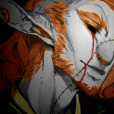
Bram Stoker Posted October 24, 2014 Report Share Posted October 24, 2014 This quite strikes my fancy. Link to comment Share on other sites More sharing options...
Yemachu Posted October 24, 2014 Report Share Posted October 24, 2014 Seems like I was not the only one with the idea to create an icon for Halloween... You (Brothar) were, however, earlier with creating a topic for it. Here is the icon I created (sort of...). Link to comment Share on other sites More sharing options...
Thar Posted October 24, 2014 Author Report Share Posted October 24, 2014 Here's another idea Link to comment Share on other sites More sharing options...
Aix Posted October 24, 2014 Report Share Posted October 24, 2014 Here's another idea This one I like better. I think I'll put this one up, unless you all really want the other one. Link to comment Share on other sites More sharing options...
Night Posted October 24, 2014 Report Share Posted October 24, 2014 I could list off all of the things wrong with it but since you didn't make this thread in showcase I'm going to assume you don't want cnc. Simply put, it just isn't clean. Not to say it's bad, conceptually they both work in some regards but the execution, which is more important, isn't on par. Link to comment Share on other sites More sharing options...
Thar Posted October 24, 2014 Author Report Share Posted October 24, 2014 I could list off all of the things wrong with it but since you didn't make this thread in showcase I'm going to assume you don't want cnc. Simply put, it just isn't clean. Not to say it's bad, conceptually they both work in some regards but the execution, which is more important, isn't on par. I'll need some training in order to make something that's actually clean. Feel free to list them, though. Reason why I didn't put it in showcase was so that more people can see it. Link to comment Share on other sites More sharing options...
Thar Posted October 24, 2014 Author Report Share Posted October 24, 2014 Link to comment Share on other sites More sharing options...
Toffee. Posted October 24, 2014 Report Share Posted October 24, 2014 Logo is 2spoopy4me Link to comment Share on other sites More sharing options...
Aix Posted October 24, 2014 Report Share Posted October 24, 2014 Red + Green = Christmas. We'll keep this logo until New Years. Link to comment Share on other sites More sharing options...
Nazara Posted October 25, 2014 Report Share Posted October 25, 2014 LOGOS ARE IRRELEVANT. DESIGNS ARE IRRELEVANT. WE DO NOT REQUIRE ADVERTISING. THAT BEING SAID, WE FIND THE ZOMBIE LOGO TO BE QUITE NEAT. Link to comment Share on other sites More sharing options...
Dr Heinz Doofenshmirtz Posted October 26, 2014 Report Share Posted October 26, 2014 These are the living essense of spooky. How did you create such ghastly header-homepage things? Link to comment Share on other sites More sharing options...
Thar Posted October 26, 2014 Author Report Share Posted October 26, 2014 Excuse me while I obsess over not being able to unsee this: Link to comment Share on other sites More sharing options...
Thar Posted October 26, 2014 Author Report Share Posted October 26, 2014 More holidays: Link to comment Share on other sites More sharing options...
Aix Posted October 26, 2014 Report Share Posted October 26, 2014 More holidays: Not sure why the hearts are pixelated. Are those Minecraft health symbols? Don't quite like the placement of the big clover, the hat is nice though. You should also make the red outline yellow or light green so it doesn't give off any Christmas vibes because anything red and green is automatically Christmas. Link to comment Share on other sites More sharing options...
Thar Posted October 26, 2014 Author Report Share Posted October 26, 2014 Not sure why the hearts are pixelated. Are those Minecraft health symbols? Yeah, I figured it'd resemble Minecraft too much. I redid it: Don't quite like the placement of the big clover So where would it look better at? Link to comment Share on other sites More sharing options...
Aix Posted October 26, 2014 Report Share Posted October 26, 2014 Yeah, I figured it'd resemble Minecraft too much. I redid it: So where would it look better at? Hmm... I think you'd be better off making a bunch of small clovers. Link to comment Share on other sites More sharing options...
Thar Posted October 26, 2014 Author Report Share Posted October 26, 2014 Hmm... I think you'd be better off making a bunch of small clovers. Eh, couldn't find any that worked, so I just included the hat. Link to comment Share on other sites More sharing options...
Toffee. Posted October 26, 2014 Report Share Posted October 26, 2014 The hat looks like it is in front of the Y. Assuming, of course, you wanted to make it look like it was wearing it. Link to comment Share on other sites More sharing options...

Recommended Posts
Archived
This topic is now archived and is closed to further replies.