Alice Moonflowyr Posted January 11, 2013 Report Share Posted January 11, 2013 [IMG]http://i49.tinypic.com/nyah7a.png[/IMG] Yeah, I know it isnt that good xD CnC or w/e. Link to comment Share on other sites More sharing options...
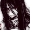
Sora1499 Posted January 11, 2013 Report Share Posted January 11, 2013 The background looks too bland to me. But the figure has quite a lot of detail Link to comment Share on other sites More sharing options...
Aix Posted January 11, 2013 Report Share Posted January 11, 2013 What bothers me the most is that his upper back and a bit of the back of his head is blended into the background, as they are both black, and the focal point is too much off to the side. Move the guy closer to the center (though not dead center) and you should be fine. Link to comment Share on other sites More sharing options...
Alice Moonflowyr Posted January 12, 2013 Author Report Share Posted January 12, 2013 [quote name='☯AixDivadis☯' timestamp='1357939550' post='6118371'] What bothers me the most is that his upper back and a bit of the back of his head is blended into the background, as they are both black, and the focal point is too much off to the side. Move the guy closer to the center (though not dead center) and you should be fine. [/quote]Hmm...it's kinda supposed to blend into the BG. I tried moving it, and was displeased with the result =P Link to comment Share on other sites More sharing options...
Aix Posted January 12, 2013 Report Share Posted January 12, 2013 The guy is sorta the focal, ya know. He needs to stand out, while his mount can be blended away. Link to comment Share on other sites More sharing options...
Alice Moonflowyr Posted January 12, 2013 Author Report Share Posted January 12, 2013 Yeah I know. But I like the way his back kind of flows into the BG. Link to comment Share on other sites More sharing options...
RickiMinaj Posted January 13, 2013 Report Share Posted January 13, 2013 [quote name='Spike the Bloody' timestamp='1358027175' post='6119121'] Yeah I know. But I like the way his back kind of flows into the BG. [/quote] Work with it then. There's so much more you could do with this piece. I feel like it's unfinished, so I guess I'll critique what is in front of me. First off, lighting. Your background lighting and render lighting cooperate less than Yugi and Kaiba. The light streaks in the background are not helping either. Composition wise, I would like to quote sassy gay friend with "Look at your life, look at your choices". Seriously though, it's so imbalanced because of the overuse of black and dark coloring that I feel like the darker side is going to fall out of the image square itself. The last thing I want to point out to you is that your render has a huge amount of detail yet your background has none. This makes your image very front heavy. You need to train your eye to recognize balance within images before selecting resources to use. Link to comment Share on other sites More sharing options...
-DG- Posted January 14, 2013 Report Share Posted January 14, 2013 As far as position goes, I think it's fine IF you make this a custom image. I see alot of potention for it as a custom image, rather than a tag. WOrk with that, and you might be happier with results. As for now, it's far too monotone IMO. It's a tad too dark. At least, the focal is. It's hard to distinguish the details in the focal. Link to comment Share on other sites More sharing options...

Recommended Posts
Archived
This topic is now archived and is closed to further replies.