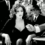
Catman25 Posted April 4, 2010 Report Share Posted April 4, 2010 Something new. Text is bad I know. Link to comment Share on other sites More sharing options...
Twenty-five Zero Oh-oh Posted April 4, 2010 Report Share Posted April 4, 2010 Some parts look slightly LQ for some reason. I like the flow but maybe you could add more lighting? Link to comment Share on other sites More sharing options...
Flexh Posted April 4, 2010 Report Share Posted April 4, 2010 Urm i actually like the text but it is kinda confuzing(the picture) Link to comment Share on other sites More sharing options...
Catman25 Posted April 5, 2010 Author Report Share Posted April 5, 2010 Some parts look slightly LQ for some reason. I like the flow but maybe you could add more lighting? I think I made a vital mistake by blurring the stock bg. =/ Link to comment Share on other sites More sharing options...
Guest JoshIcy Posted April 5, 2010 Report Share Posted April 5, 2010 Some parts look slightly LQ for some reason. I like the flow but maybe you could add more lighting? I think I made a vital mistake by blurring the stock bg. =/ Prevents artistic styles from clashing, what are you talking about? Link to comment Share on other sites More sharing options...
Night Posted April 5, 2010 Report Share Posted April 5, 2010 Not bad but, the whole tag doesnt feel as if anything blends. Link to comment Share on other sites More sharing options...
Catman25 Posted April 6, 2010 Author Report Share Posted April 6, 2010 Some parts look slightly LQ for some reason. I like the flow but maybe you could add more lighting? I think I made a vital mistake by blurring the stock bg. =/ Prevents artistic styles from clashing' date=' what are you talking about?[/quote'] In my opinion, I could've used a better bg, instead of a blurred stock, that's what I'm talking about. That's what I perceived to be the lq source. Link to comment Share on other sites More sharing options...

Recommended Posts
Archived
This topic is now archived and is closed to further replies.