Seta Posted April 3, 2010 Report Share Posted April 3, 2010 Link to comment Share on other sites More sharing options...
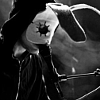
Twenty-five Zero Oh-oh Posted April 3, 2010 Report Share Posted April 3, 2010 The text is kinda cool but the colors of it aren't really working for me. The smudge(?) on the left also kinda bothers me. Idk why though. Link to comment Share on other sites More sharing options...
Seta Posted April 3, 2010 Author Report Share Posted April 3, 2010 Just ignore the text version, realized it's bad. Link to comment Share on other sites More sharing options...
Seta Posted April 4, 2010 Author Report Share Posted April 4, 2010 bump Link to comment Share on other sites More sharing options...
/성成현賢/.led Posted April 4, 2010 Report Share Posted April 4, 2010 The smudging could have been done better... It needs more depth and a "WoW" facotr... More EFX may be needed too Link to comment Share on other sites More sharing options...
Seta Posted April 5, 2010 Author Report Share Posted April 5, 2010 The smudging was executed like I wanted it to be, but the smudge style itself does look bad here, I admit.Eh, could use some effects, but they could also ruin it. Link to comment Share on other sites More sharing options...
.Lost Posted April 5, 2010 Report Share Posted April 5, 2010 Imo you sharpened it a tad too much ;P Link to comment Share on other sites More sharing options...
Seta Posted April 6, 2010 Author Report Share Posted April 6, 2010 I liek know that D:I maybe 'accidentally' did cough cough Link to comment Share on other sites More sharing options...
Dark Lightning Posted April 6, 2010 Report Share Posted April 6, 2010 Love the blend of colors and the Stars in the BG. Very nice, IMO. Link to comment Share on other sites More sharing options...

Recommended Posts
Archived
This topic is now archived and is closed to further replies.