Enrise Posted December 31, 2009 Report Share Posted December 31, 2009 So, I recently got a drawing pad, cool cool. And I did some random drawings. However, I soon started to do Album Covers for my own lolz.But then I decided to give YCM some of what I did over teh holidays: <3, <\3, <3?, whatever floats your boat. PS. Still trying to get the hang of the drawing pad. Link to comment Share on other sites More sharing options...
Guest JoshIcy Posted December 31, 2009 Report Share Posted December 31, 2009 Harder Shapes... Seriously. Link to comment Share on other sites More sharing options...
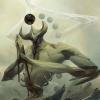
Nishi-chan Posted December 31, 2009 Report Share Posted December 31, 2009 Looks like a Lincoln Park Album =Dlolemo Pretty good for hand-drawn. Link to comment Share on other sites More sharing options...
Catman25 Posted December 31, 2009 Report Share Posted December 31, 2009 That guitar's actually pretty cool. =) Link to comment Share on other sites More sharing options...
Enrise Posted December 31, 2009 Author Report Share Posted December 31, 2009 Harder Shapes... Seriously. Still trying to get the hang of it <' date='< Looks like a Lincoln Park Album =Dlolemo Pretty good for hand-drawn. Hate Lincoln Park <,<And lolno not emo >,,,> If you know the whole thing behind it, you would know about it... And thanks. That guitar's actually pretty cool. =) Thanks. Link to comment Share on other sites More sharing options...
Icy Posted December 31, 2009 Report Share Posted December 31, 2009 I want you to look (not adapt) at how that person moves the pad around. It's a fast hard shape method that's easy to pick up and change to your own preferences. Also... Remove that absolutely dreadful thing right under the text. Link to comment Share on other sites More sharing options...
Scyire Posted December 31, 2009 Report Share Posted December 31, 2009 I like it. Link to comment Share on other sites More sharing options...
Enrise Posted December 31, 2009 Author Report Share Posted December 31, 2009 I want you to look (not adapt) at how that person moves the pad around. It's a fast hard shape method that's easy to pick up and change to your own preferences. Also... Remove that absolutely dreadful thing right under the text. 1, I never really intended to be a pro or something at a drawing pad. 2, The cigarette is supposed to be part of the album cover design =/ Link to comment Share on other sites More sharing options...
Icy Posted December 31, 2009 Report Share Posted December 31, 2009 I want you to look (not adapt) at how that person moves the pad around. It's a fast hard shape method that's easy to pick up and change to your own preferences. Also... Remove that absolutely dreadful thing right under the text. 1' date=' I never really intended to be a pro or something at a drawing pad. 2, The cigarette is supposed to be part of the album cover design =/[/quote'] 1) I didnt say you were. But the motions WILL help you. Not the technique. So yeah... Im not trying to teach you some advanced stuff. This is basic. Boring Basic. 2) Idc what it's name is, it's disgusting... Use a burning Log, idc... Just not that... Link to comment Share on other sites More sharing options...
Charizard Posted December 31, 2009 Report Share Posted December 31, 2009 Its good. Although the background could use something. Maybe a city background? Link to comment Share on other sites More sharing options...
Enrise Posted December 31, 2009 Author Report Share Posted December 31, 2009 Its good. Although the background could use something. Maybe a city background? Blue was used to indicate sadness. Pretty simple if you go with the color meanings =o And thanks =D Link to comment Share on other sites More sharing options...
Hrash0 Posted December 31, 2009 Report Share Posted December 31, 2009 I actually loled. Link to comment Share on other sites More sharing options...
:^) Posted December 31, 2009 Report Share Posted December 31, 2009 It's not great, but it would look nice with like Perfectliciousness Link to comment Share on other sites More sharing options...
Enrise Posted December 31, 2009 Author Report Share Posted December 31, 2009 I actually loled. I actually didn't.Have nothing to say? Get out >' date=',,> It's not great, but it would look nice with like Perfectliciousness No such thing. Sorry =/ Link to comment Share on other sites More sharing options...
:^) Posted December 31, 2009 Report Share Posted December 31, 2009 D: Why nots? Link to comment Share on other sites More sharing options...
Enrise Posted December 31, 2009 Author Report Share Posted December 31, 2009 D: Why nots? I don't knows D: Link to comment Share on other sites More sharing options...
Seta Posted December 31, 2009 Report Share Posted December 31, 2009 You just need some practice. Link to comment Share on other sites More sharing options...
:^) Posted December 31, 2009 Report Share Posted December 31, 2009 What songs would be on this album? Link to comment Share on other sites More sharing options...
Enrise Posted December 31, 2009 Author Report Share Posted December 31, 2009 You just need some practice. Yeah I know. I got some positive responses actually. What songs would be on this album? I wouldn't know, it was just something I started.I think I would say some songs that are based around how life can turn so sh*tty against you.Rough guess though. Link to comment Share on other sites More sharing options...
:^) Posted December 31, 2009 Report Share Posted December 31, 2009 So Emo Songs O_o? Link to comment Share on other sites More sharing options...
-Berserker- Posted December 31, 2009 Report Share Posted December 31, 2009 Try grayscale... Just to see how it looks. Link to comment Share on other sites More sharing options...
Enrise Posted January 1, 2010 Author Report Share Posted January 1, 2010 I got it grayed. And this is what I got: Link to comment Share on other sites More sharing options...
-Berserker- Posted January 1, 2010 Report Share Posted January 1, 2010 I got it grayed. And this is what I got: That looks good. But the money isn't so identifiable, and the guitar needs more contrast. Link to comment Share on other sites More sharing options...
Enrise Posted January 1, 2010 Author Report Share Posted January 1, 2010 I got it grayed. And this is what I got: That looks good. But the money isn't so identifiable' date=' and the guitar needs more contrast.[/quote'] That why I liked it colored =/ Link to comment Share on other sites More sharing options...
Enrise Posted January 2, 2010 Author Report Share Posted January 2, 2010 BUMP >,,,> Link to comment Share on other sites More sharing options...

Recommended Posts
Archived
This topic is now archived and is closed to further replies.