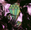
White Devil Posted August 22, 2009 Report Share Posted August 22, 2009 [align=center]Hello everybody. This is the first time I post in the Showcase Section. Today, I am showing you an example of the Promo Cards I make with GIMP. I might make a tut. with that, but I'm not sure about it. The original card was made by my friend BenTennyson for our Marvel Collab., and I added the special effects after. It was made with GIMP. There is a link to the thread in my sig. So, enough talking, here's the Promo: [spoiler= Homemade Promo Card] Hope you all like it.[/align] Link to comment Share on other sites More sharing options...
E-Hero Kyle Posted August 22, 2009 Report Share Posted August 22, 2009 Its very good, it looks like the render is going to pop outWhy is the card red??? Anyway good 8/10 Link to comment Share on other sites More sharing options...
Sparta™ Posted August 22, 2009 Report Share Posted August 22, 2009 I see what u did thar It looks like something I know. I can't put my finger on it, but I know EXACTLY what you did. I just can't remember. It's on the tip of my tounge! ):< I hate when that happens. XD Link to comment Share on other sites More sharing options...
Flash Flyer - Sakura Posted August 22, 2009 Report Share Posted August 22, 2009 Its very good' date=' it looks like the render is going to pop out[/quote'] this. I'd give you a 9.5/10 Link to comment Share on other sites More sharing options...
JG. Posted August 22, 2009 Report Share Posted August 22, 2009 Recoloured card and then the image on top -.-. Not good. Do something more advanced. Link to comment Share on other sites More sharing options...
White Devil Posted August 22, 2009 Author Report Share Posted August 22, 2009 Recoloured card and then the image on top -.-. Not good. Do something more advanced. [align=center]That's not what I did... -__-"I recoloured the card. Then' date=' I opened the same card a second time, took the stars, Attribute and Sticker and paste them on the recoloured version. Then, I copied and pasted the image on a new layer, made it bigger and changed the opacity. After that, I holoed the original pic. That's it. I know it isn't that complicated, but I think the result is pretty good.[/align'] Link to comment Share on other sites More sharing options...
.Leo Posted August 22, 2009 Report Share Posted August 22, 2009 great idea. i like the way the render comes out. 10/10 from me Link to comment Share on other sites More sharing options...
+Jono Posted August 22, 2009 Report Share Posted August 22, 2009 Recoloured card and then the image on top -.-. Not good. Do something more advanced. [align=center]That's not what I did... -__-"I recoloured the card. Then' date=' I opened the same card a second time, took the stars, Attribute and Sticker and paste them on the recoloured version. Then, I copied and pasted the image on a new layer, made it bigger and changed the opacity. After that, I holoed the original pic. That's it. I know it isn't that complicated, but I think the result is pretty good.[/align'] In other words:Recoloured card and then the image on top -.-. Not good. Do something more advanced. This looks pretty bad. The enlargement of the whole image interferes with the rest of the card, especially when it hits the effect box, which is barely readable as it is. Link to comment Share on other sites More sharing options...
Avooc Posted August 22, 2009 Report Share Posted August 22, 2009 Pretty cool. 8/10 Link to comment Share on other sites More sharing options...
White Devil Posted August 23, 2009 Author Report Share Posted August 23, 2009 Recoloured card and then the image on top -.-. Not good. Do something more advanced. [align=center]That's not what I did... -__-"I recoloured the card. Then' date=' I opened the same card a second time, took the stars, Attribute and Sticker and paste them on the recoloured version. Then, I copied and pasted the image on a new layer, made it bigger and changed the opacity. After that, I holoed the original pic. That's it. I know it isn't that complicated, but I think the result is pretty good.[/align'] In other words:Recoloured card and then the image on top -.-. Not good. Do something more advanced. This looks pretty bad. The enlargement of the whole image interferes with the rest of the card' date=' especially when it hits the effect box, which is barely readable as it is.[/quote'] [align=center]Well, normally, I always copy the effect and paste it under the card.So it's pretty readable this way. And, if you complain about the fact you can't see the stats, well, the only thing you have to do is the same thing as for the effect: you copy the stats and paste them under the card -__-"[/align] Link to comment Share on other sites More sharing options...
Mehmani Posted August 23, 2009 Report Share Posted August 23, 2009 The effect is barely readable due to the recolouring and low opacity render. Link to comment Share on other sites More sharing options...
White Devil Posted August 24, 2009 Author Report Share Posted August 24, 2009 The effect is barely readable due to the recolouring and low opacity render. I know. When I posted it in my thread' date=' I posted the effect. But I don't need to post it here, because this card is not there to be commented on it's effect, but on it's appearance.[/center'] Link to comment Share on other sites More sharing options...

Recommended Posts
Archived
This topic is now archived and is closed to further replies.