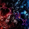
PowerlinX Posted July 16, 2009 Report Share Posted July 16, 2009 This is my second attempt at a stocked sig. [spoiler=Original Stock] Here's the actual sig: Avi: CnC Link to comment Share on other sites More sharing options...
coolmoo Posted July 16, 2009 Report Share Posted July 16, 2009 ehh, stock isnt the smartest one to start off with, but you did good with what you have. ^_^ Link to comment Share on other sites More sharing options...
carlynagisa_fan Posted July 16, 2009 Report Share Posted July 16, 2009 eee.. what did you doo to bumblebee?Bumblebee looks squished Link to comment Share on other sites More sharing options...
SushiTheLegend Posted July 16, 2009 Report Share Posted July 16, 2009 eee.. what did you doo to bumblebee?Bumblebee looks squishedNot to mention covered with POOP. >> Link to comment Share on other sites More sharing options...
PowerlinX Posted July 16, 2009 Author Report Share Posted July 16, 2009 eee.. what did you doo to bumblebee?Bumblebee looks squished Probably because of how his gun is. It was like that with the original stock because the screenshot was when Bumblebee was moving his gun in the movie. eee.. what did you doo to bumblebee?Bumblebee looks squishedNot to mention covered with POOP. >> What? Really? I don't see it. But I did put some splatter brushes in there. ehh' date=' stock isnt the smartest one to start off with, but you did good with what you have. ^_^[/quote'] Thanks :) Link to comment Share on other sites More sharing options...
LiAM Posted July 16, 2009 Report Share Posted July 16, 2009 It's not a stock, looks like you just rendered it and covered it with a c4d. The effect is cool. But more lighting on the gun area maybe, and the splatter looks too cartoony. Link to comment Share on other sites More sharing options...
PowerlinX Posted July 16, 2009 Author Report Share Posted July 16, 2009 I didn't render it, but it looks like I did. There were no c4d's just smudging, brushing, and blurring. It looks sorta cartoon I guess. But thanks for the positive feedback :) Link to comment Share on other sites More sharing options...
Kuro no Keiyakushu Posted July 16, 2009 Report Share Posted July 16, 2009 Pretty good job with the stock you had and nice job on making it LOOK LIKE it was rendered =DI like the dirty-looking brown yellowish background because that's basically bumblebeeanyway, pretty darn good Link to comment Share on other sites More sharing options...

Recommended Posts
Archived
This topic is now archived and is closed to further replies.