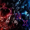
PowerlinX Posted May 9, 2009 Report Share Posted May 9, 2009 [spoiler=V1] [spoiler=V2]Sig:Avi: V 2.1Sig:Avi: Link to comment Share on other sites More sharing options...
Guest Star Posted May 9, 2009 Report Share Posted May 9, 2009 It seems like you overdid the sparkles. Link to comment Share on other sites More sharing options...
Haseo Posted May 9, 2009 Report Share Posted May 9, 2009 You are getting better at making sigs! I can't really see the Bg much because of all the sparkles. Try to put it behind the render. Also, the background is kinda ok, but try to make it a different color. Sorry but no flow or depth Link to comment Share on other sites More sharing options...
§hadow §triker Posted May 9, 2009 Report Share Posted May 9, 2009 The sparkle brushing really ruins itAnd it has not flow or depthGet rid of sparkles Link to comment Share on other sites More sharing options...
Mehmani Posted May 9, 2009 Report Share Posted May 9, 2009 It's pretty good. The render's a bit pixely, and some of the sparkles don't look good over it. ~ Alf Link to comment Share on other sites More sharing options...
LiAM Posted May 9, 2009 Report Share Posted May 9, 2009 Add a bit more thickness to the focal, make its own colours stand out a tiny bit. Get rid of the sparkles, there's too many and it catches the eyes away from the focal. And the splatter brush in the BG could be improved with some effects. Link to comment Share on other sites More sharing options...
PowerlinX Posted May 10, 2009 Author Report Share Posted May 10, 2009 I've edited the sig. Link to comment Share on other sites More sharing options...
LiAM Posted May 10, 2009 Report Share Posted May 10, 2009 Urm, it looks better without the sparkles, but the lines just cover up the focal, another edit could be, erasing the lines that cover the focal, so its no covered up. Link to comment Share on other sites More sharing options...
Setion Posted May 10, 2009 Report Share Posted May 10, 2009 wow nice sig but i dont like the X,s Link to comment Share on other sites More sharing options...
PowerlinX Posted May 10, 2009 Author Report Share Posted May 10, 2009 Thank you for your advice and saying what I could improve on, and not just a "You Fail" (I've actually had that happen to me before by some very well respected members). I've finished V 2.1 and am uploading them to Photobucket right now. EDIT: V 2.1 is up. Link to comment Share on other sites More sharing options...
§hadow §triker Posted May 10, 2009 Report Share Posted May 10, 2009 Although it is still not that good, V 2.1 is the best of these Link to comment Share on other sites More sharing options...

Recommended Posts
Archived
This topic is now archived and is closed to further replies.