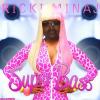
RickiMinaj Posted April 5, 2009 Report Share Posted April 5, 2009 Please no harsh words, i wanted to try this out. What do you guys think? Link to comment Share on other sites More sharing options...
Lemniscate Posted April 5, 2009 Report Share Posted April 5, 2009 Don't do this style again.Fun for an experiment.Terrible otherwise. Mainly it just looks bland. Link to comment Share on other sites More sharing options...
RickiMinaj Posted April 5, 2009 Author Report Share Posted April 5, 2009 ahhjust curiouse, thnx for your opinion ^^ Link to comment Share on other sites More sharing options...
Guest KAJN Posted April 5, 2009 Report Share Posted April 5, 2009 "Would have looked better if exodia was breaking or coming out of the Circle. Background colors aren't selective for the whole booster. Link to comment Share on other sites More sharing options...
RickiMinaj Posted April 5, 2009 Author Report Share Posted April 5, 2009 good point. But i thought green would go well with yellow Link to comment Share on other sites More sharing options...
Guest KAJN Posted April 5, 2009 Report Share Posted April 5, 2009 "When you're making a booster, think of blending. They are more like tags when it comes to colors. Link to comment Share on other sites More sharing options...
Freeshooter Posted April 6, 2009 Report Share Posted April 6, 2009 Did you use PS or GIMP? Link to comment Share on other sites More sharing options...
GHawk Posted April 6, 2009 Report Share Posted April 6, 2009 By the looks of it, it is made with Gimp. Dont use this style again. Link to comment Share on other sites More sharing options...
-DG- Posted April 6, 2009 Report Share Posted April 6, 2009 Make text wider. The sparkles are really odd, and don't fit this. Not bad, though. Link to comment Share on other sites More sharing options...
Ezio Posted April 6, 2009 Report Share Posted April 6, 2009 [align=center]Make sure all text is in CAPSGreen BG doesn't goMake Exodia biggerMake text in line with Bars...[/align] Link to comment Share on other sites More sharing options...
Andinator Posted April 6, 2009 Report Share Posted April 6, 2009 i like it (the idea at least). Most people only like t ostick with proffesional looks. but more artistic minds like to do things out of the box. Thats why we only have a couple of people actually making everything on a booster by themselves. But just cause u dont have a custom pack doesnt mean that your not artistic. Its more of why. For example: DG made his tech circle because ripping one had a low quality to it. Con. started the Japanese Booster Pack/ Cards because too many people made booster packs in english. So basically, its not what you made, but why you made it. if i had to guess, I'd say you were trying something new. My suggestion would probably be to come up with a different kind of circle in the back. Arcane and Tech Circles are really common, so try to look for a circle that could work!! Link to comment Share on other sites More sharing options...
§hadow §triker Posted April 6, 2009 Report Share Posted April 6, 2009 I like the idea kinda. Putting the render in the txt circle. Nice experiment, but i suggest sticking to the normal way. Not bad htough. Link to comment Share on other sites More sharing options...

Recommended Posts
Archived
This topic is now archived and is closed to further replies.